
This is an expanded and tidied-up version of a tutorial originally done as a live BlueSky thread. I was asked by a few people how I paint my Blood Angels and so I thought I’d do a step-by-step guide (partly for my own benefit, so I can remember how to do it when I come back to this army in future).
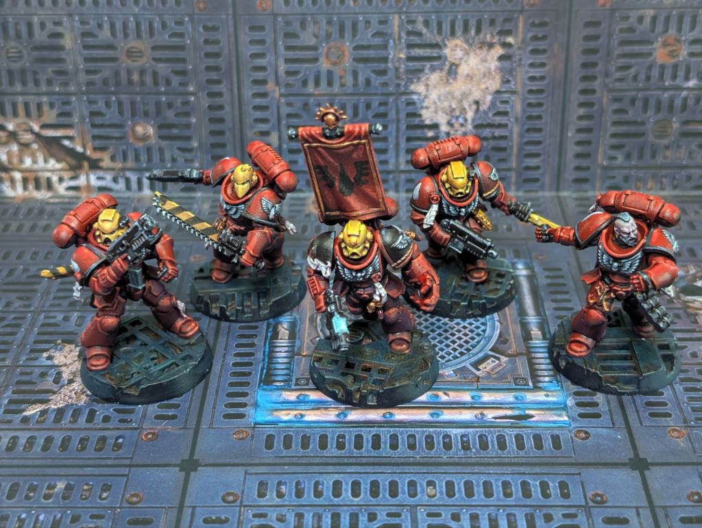
Here’s some examples of where we’re heading:

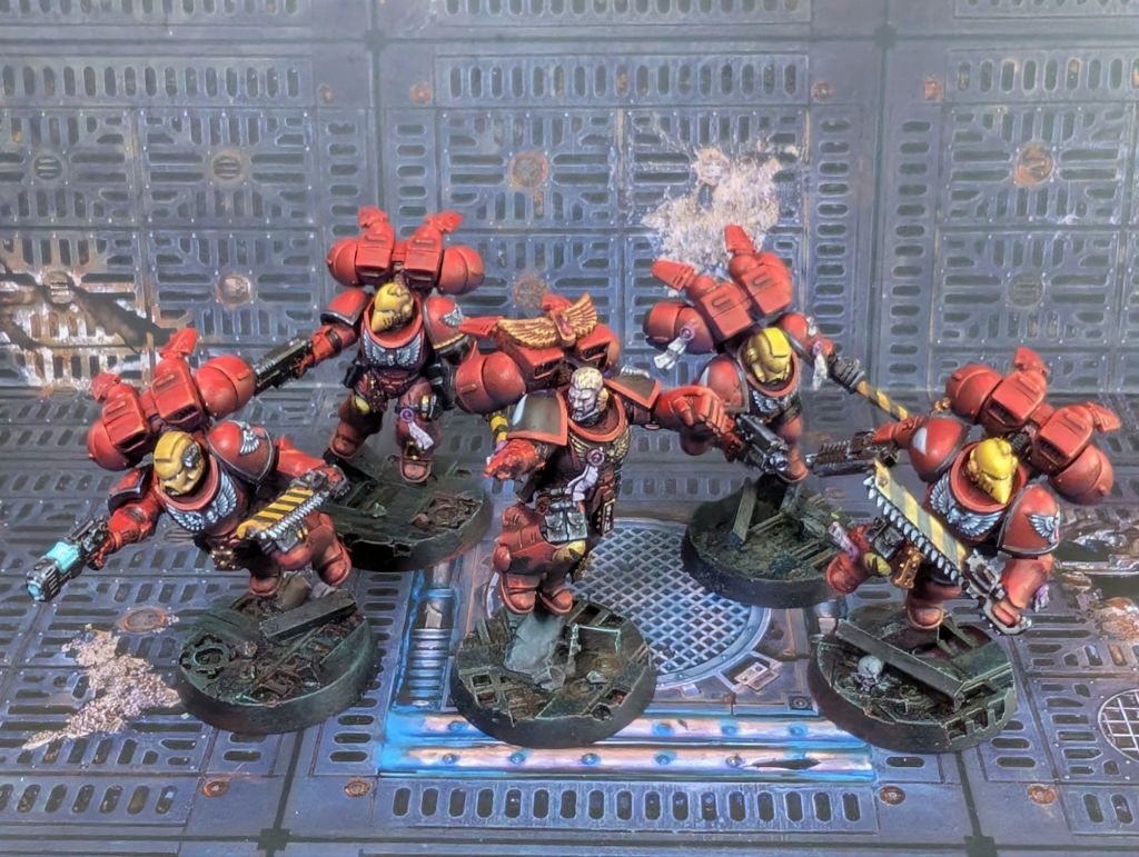
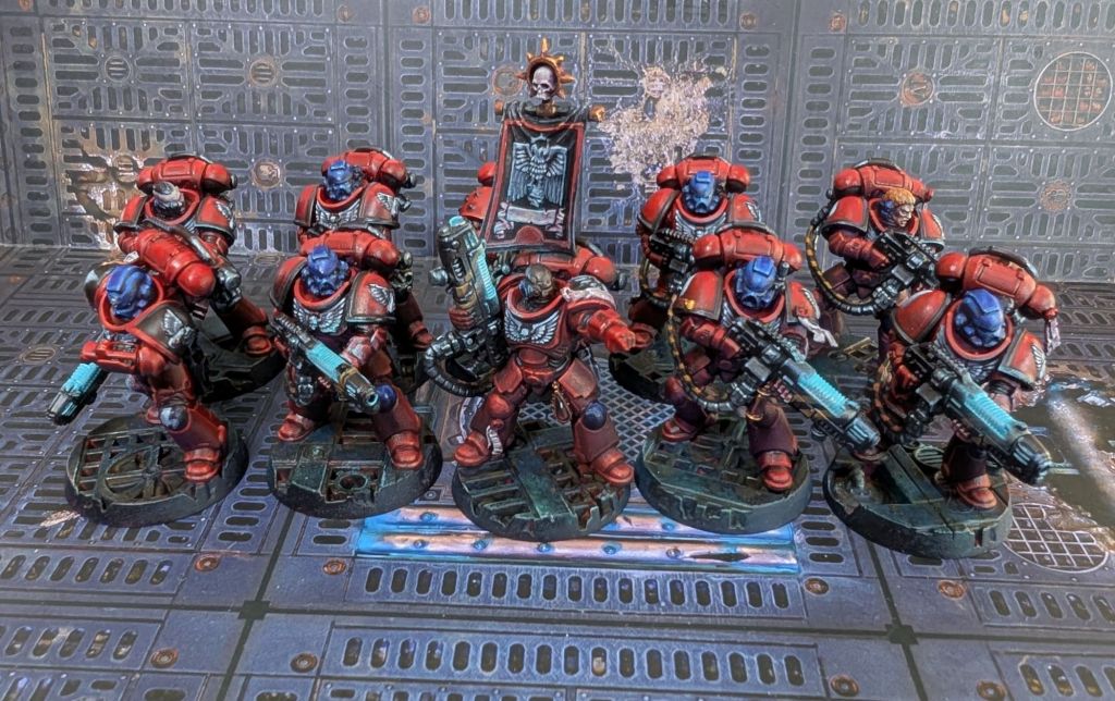

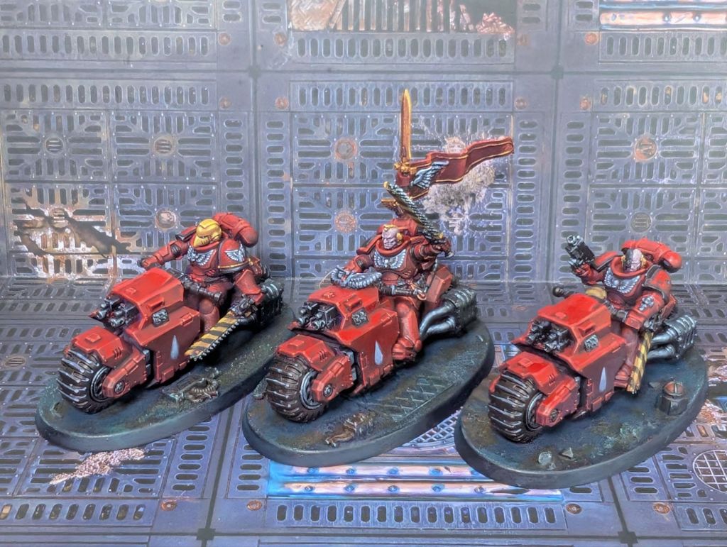

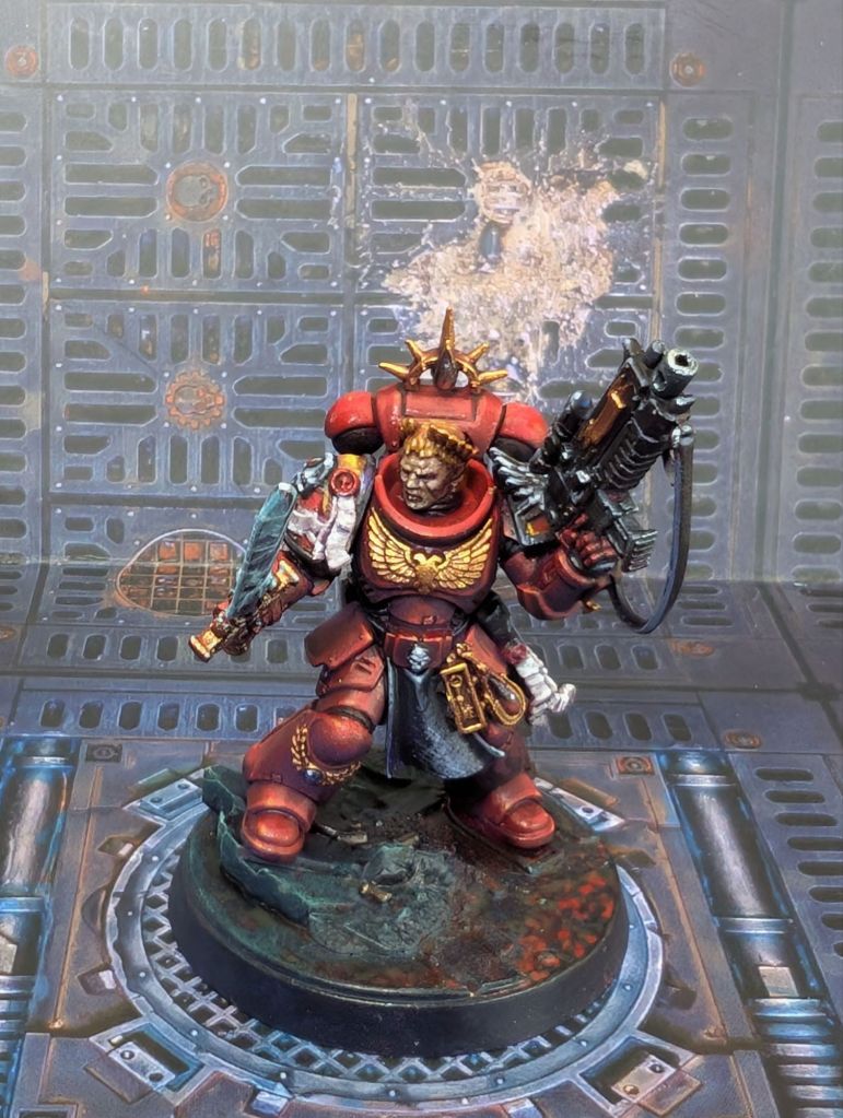
The Scheme
This is more-or-less a standard Blood Angels colour scheme, but even so it took me quite a long time to decide on the exact scheme, colour palette and methodology.
First – why Blood Angels? A few reasons:
- My first ever Warhammer army was Blood Angels back in the distant dark age of 1995. I think the main reason for that choice is that they were what was on the box art for 2nd edition and all the starter painting guides told you how to paint them like that. But also, I thought vampires were cool back then (this is before Twilight came out and ruined them for a generation, and I was ten).
- I still think vampires are cool! Or at least, I personally find the ‘angelic catholic italian renaissance vampires trying to do their best despite severe mental health problems’ stylings of the Blood Angels a lot more interesting than ‘the most space marine space marines, but also romans’ or ‘we really like this particular animal’ or ‘we’re utilitarian and have hands’ themes of the other first founding chapters. They even get to be vampire-themed without having to be the whiny goth ones, because Dark Angels exist. YMMV.
- I like red.
- I did consider creating a custom BA successor chapter and tried out a few variations, but they all ended up as ‘predominantly red space marine’. From the other side of the table ‘predominantly red space marine’ is just going to read as Blood Angels anyway, and I didn’t really want to have the ‘uhm, well, no achtually these are a totally original chapter called the Blood Owls’ conversation, basically ever.
- I already had some of the shoulder pads with the moulded logo.
With that decision sort-of made, I had the basic colour scheme handed to me, but even when working to a standard scheme there are still tweaks possible and a lot of other decisions to make; style, mood, environment, etc. that allow you to put your personal spin on that army.
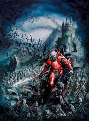
For these, I had two main sources of inspiration. First was the cover art of the box set that started it all, this classic piece by the late great John Blanche:

The other, more recent, depiction of Blood Angels that I really like is the animated series Angels of Death, which has a very striking visual style where everything is in black and white except for anything red.

These are… about as opposite visual representations of the same thing as you can get. Marrying them took a bit of figuring out.
The common element is very vivid red, so we’ll take that as our cornerstone. I did try pairing it with pure black and white but since you can’t necessarily always control the backdrop the miniature will be seen against this isn’t quite as effective in real life as it is in the animation and looked a bit dull. Instead, I decided to hint towards this a bit more subtly by having the reds be very high saturation but all the secondary colours be very desaturated and muted, to emphasise the vividness of the red by contrast.
As to what those secondary colours should be, I broadened my influences a bit. I wanted to bring out the gothic vampire side and if you google ‘vampire art’ you may notice that 90% of what comes up shares an extremely similar colour palette – reds and purples offset by paler blue-greens. This makes perfect sense from a colour theory perspective because these are complementary colours and also these are generally spooky night scenes which these colours evoke.
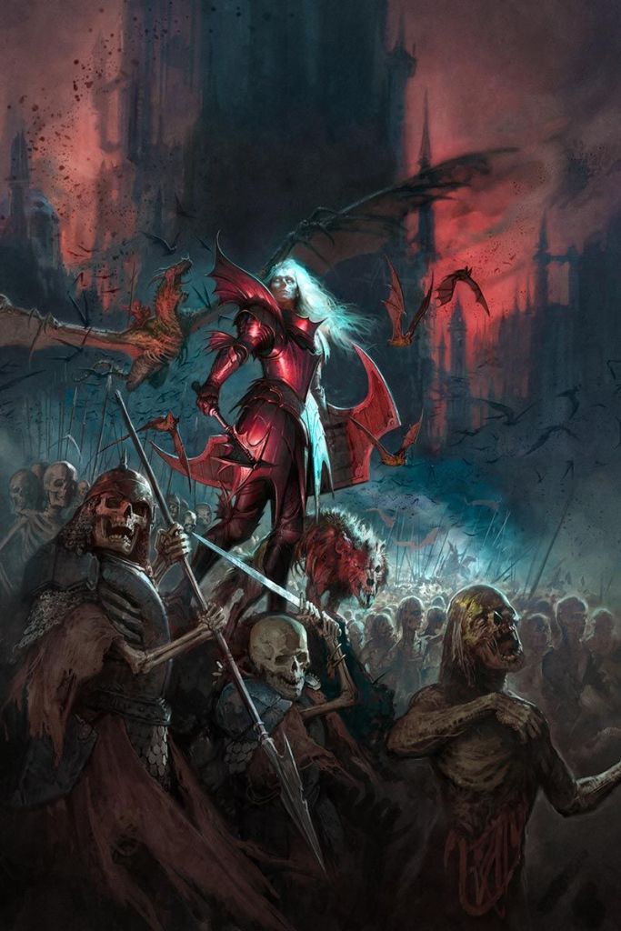
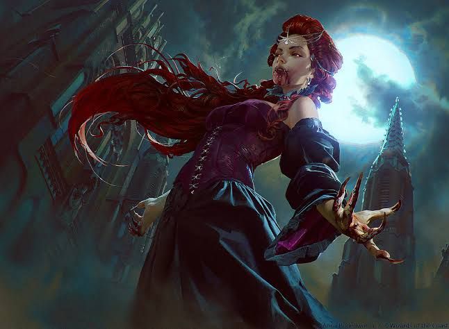
The main change I made to the standard scheme was to make the chest aquila and other feathered details white instead of the more normal black or gold. I also elected to make these marines (mostly) members of the 3rd company, who bear a white teardrop symbol on their right pauldron. This fit with the low-saturation secondary palette and also allowed me to create a triad of high-contrast white areas on the chest and shoulders to draw the eye in and direct it around the central portion of the model, which is generally the bit I want people to focus on.
This then guided the rest of my colour choices – not-quite greyscale with slight tints of blues, greens and purples to give a tad more contrast and make the red ‘pop’.
This ‘vivid red, muted everything else’ ruleset I’d built for myself lasted an entire two squads before I ran into a problem. Blood Angels are, canonically, not just red – they use helmet colours to denote specialist squad functions (red = battleline, yellow = assault, blue = fire support, gold = veteran).
I considered just ignoring this and giving everyone a red helmet, but I quite like the look and it’s a fairly key part of the visual identity of the chapter in my mind, so instead I relaxed the rule slightly. Specialist squads get two full-saturation primary colours instead of just one. This ran a little counter to the ‘theory’ I’d built for myself, but I’m really glad I did it. The end result makes different squads really stand out from one another and I get that poppy cartoony 2nd edition style while still situating them in an environment that is bleaker and more grimdark.
Step-by-step Guide
For this tutorial I’m going to be painting a Blood Angels Assault Intercessor squad, but the basic recipe is the same for all of the different units shown above.
These are line troopers, so I’m aiming for a reasonable tabletop standard and I’m OK with a bit of sketchiness in exchange for speed, but again if I was painting something more special like a character I would use the same basic process just a bit more carefully and spending a bit more time on the details.
I’m not quite sure where people are drawing the line for ‘speed painting’ techniques these days, so I don’t know if this counts, but the focus is certainly on efficiency. I can knock out a marine in roughly 40 minutes (not counting building).

Construction
Step 1 is to build them. I don’t hate Primaris but there are some aspects I don’t like (the helmets, the weird kneepad rim that would mainly act to just direct an incoming blade into the top of your knee, the lack of back banners). I’ve done some mild conversion work to ‘fix’ these but this is entirely optional and not really the point of this article, so we’ll skim over it; just know that these are not entirely built as standard.

Priming/Basecoating
Step 2: It’s Prime time! I like to prime on what my partner calls ‘goblin sticks’ – dowels with blue-tack on the ends jammed through a cardboard box. It lets me rotate each model individually while keeping my hand (mostly) paint-free.

I’m very lazy and want to get the priming step to do as much work for me as possible. So we’re going to do a multi-step coloured zenithal prime which will give us a base gradient to work on top of and will give us our main armour colour. We’ll start by spraying black (any black will do – I’m using Army Painter Matt Black) from below.

Next we’ll spray a dark purple (Colour Forge Imperial Purple, in this case) from just above the horizontal – say 10° up. Don’t go too heavy and leave some black showing in the recesses.

Now dark red (Army Painter Dragon Red) from about 45° above the horizontal.
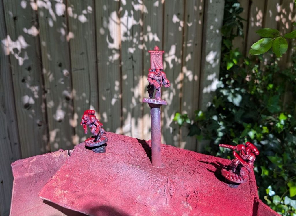
Aaand finally bright red (Army Painter Pure Red) directly from above.
I don’t know that I would recommend the Army Painter line purely as a primer – their quality control is not great (I’ve had to bin entire cans before for one reason or another) and the finish is often a lot glossier than I really want a prime coat to be. However, they have a great range of colours and in this case allow us to get an extremely bright red – something that is exceedingly difficult with a lot of other paint ranges.
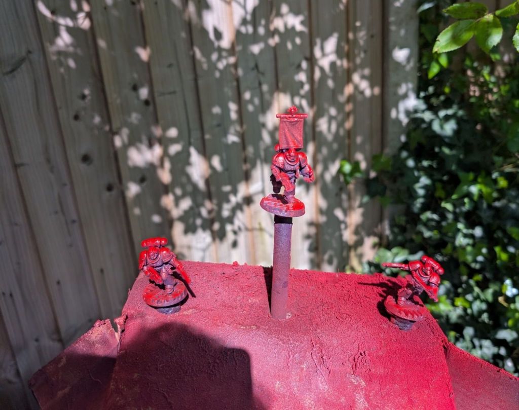
We’ve now got a nice gradient lighting effect that we’ll use as our base for most of the model for basically zero effort, we’re going to shade and highlight this a bit more and do details.

I’m using purple as a shadow colour because it will make the red ‘pop’ and look a lot brighter and more saturated than if we went straight from black to red.
For the same reasons, the black bits I basecoat with a very dark purple. (It’s a bit hard to recommend a colour match since this is Leviathan Purple, but a pot I accidentally left open for a few hours, so it dried out and ended a bit darker than usual. Probably just using Corvus Black is fine too.)
I’m still a 2nd edition boy at heart, so my Blood Angels have black pauldron trim. Feel free to leave this off if you have more modern sensibilities/incorrect opinions.

Next we basecoat the other details – Vallejo Glorious Gold for bling, Rakarth Flesh for bone, skin and parchment and Averland Sunset for helmet and sword. Base coating is my least favourite part of miniature painting so I explicitly design my schemes so that I have to do it as little as possible.
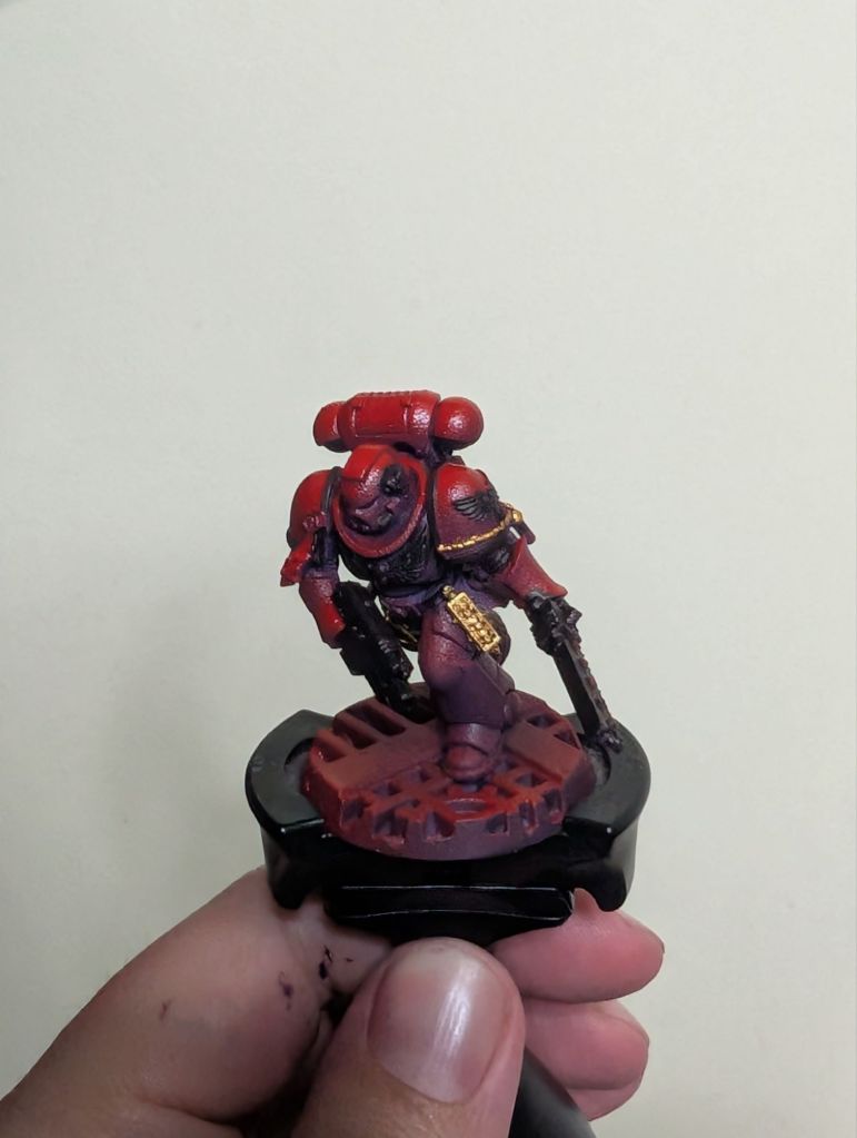

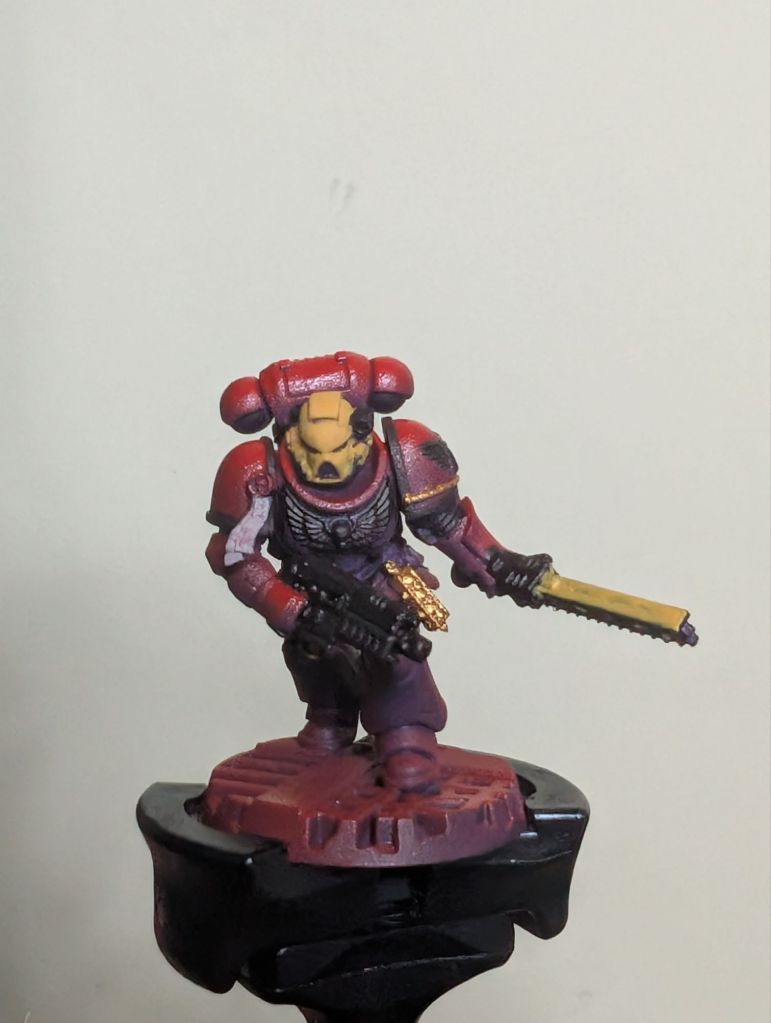
Boring basecoating stage over! Back to the fun stuff.
Shading
Slap Druchii Violet over the whole model. This will give us our ambient occlusion shading, reinforce our purple undertones, make the yellows read a bit ‘colder’, knock some of the shine off the primer (when dry) and tie the whole model together.
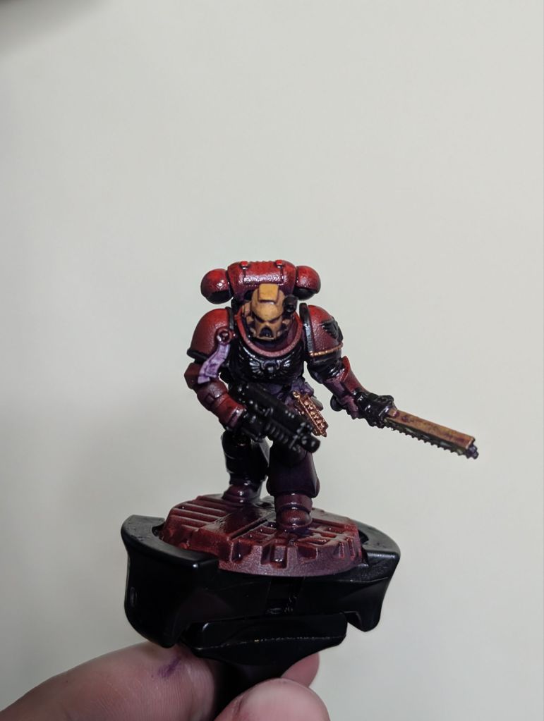
A lot of painting guides will tell you to use different shade colours to match different base colours, but I’m not a fan of that approach – I find it leaves the different areas of the model feeling a bit disconnected and lacking a sense of place. The tint of your shadows is going to be driven by your atmospheric lighting, so I like to just use one or two shade colours over the whole model to communicate the atmosphere that I’m trying to give it and to tie the whole model together.
I will later use Drakenhof Nightshade in a few areas to reinforce some of the recess shading I want to be darker and add a bit more contrast wherever needed, but I tend to do that right at the end as a final adjustment once I can see the overall composition.
Highlighting
Onto highlighting, which is actually the bulk of the work. This is by design, since this is the part of miniature painting I enjoy the most (an uncommon preference, I admit) so I design my schemes specifically to speed through everything else. I think this is actually key advice for army painting! Choose the things you enjoy (or want to practice), put your time in there and figure out how to optimise everything else. You’ll have a better time and the army will look better.
(If you do hate highlighting and want to skip this next bit, a bit of careful drybrushing will be a good substitute to get you most of the way there.)
I’m going to be employing three kinds of highlighting; volumetric, edge and point. For volumetric we’ll be painting the most upwards-facing parts of each surface, for edge we’ll be painting the edges(!) and for point we’ll be using little dots on the brightest bits.
Let’s do the yellow bits first (though the principles are the same everywhere). We’ll use Averland Sunset again to do both volumetric and edge highlights, brightening the yellows up again after the wash dulled them down.
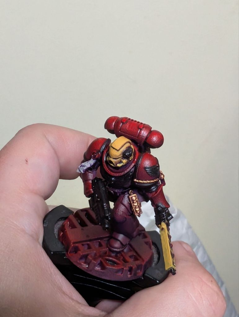
The ‘Eavy Metal style is to edge highlight pretty much every single edge on the whole model, but this is *just* a style and you *do not* have to do this. In fact it’s more ‘realistic’ not to. I just pick out the upwards facing or most prominent edges, especially as I get brighter.
With that in mind, I use a brighter yellow (Army Painter Daemonic Yellow) for my next layer, covering a smaller area of the surface/edges.
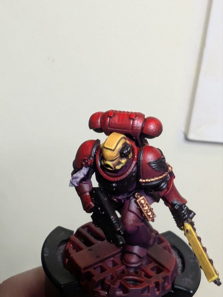
Finally, I use a very pale yellow (Dorn Yellow) for some point highlights on only the sharpest corners or highest points which would catch the light.

I love point highlights! They take seconds to do and instantly make a model look 100% better and more polished. If you only take one thing from this tutorial let it be ‘don’t sleep on point highlights’.
For both the black and white areas I use the same colour progression of bluey-greys: The Fang, Russ Grey, Fenrisian Grey and then white (Schmincke PRIMAcryl Titanium White – the only good white). I just cover a much smaller area and stop earlier on the black. This is a nice illustration of the dangers of following paint recipes – the area you cover is often far more important to the end look than the specific colour progression used, and you can end up with very different end results using exactly the same paints.

Anyway, on with the recipe.
The (3rd company) blood-drop on the pauldron I freehand by first drawing a line in a medium grey, then fattening out the bottom, then layering up to white, trying to roughly match the tone of the rest of the pauldron.

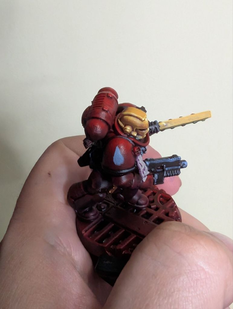

Another bonus of abusing primer as your base colour is that if you mess up (which I did) and get white paint on the red bits, it’s tough enough that you can get in there with a thumbnail and scrape off the fresher paint while (probably, hopefully, no liability accepted, etc.) not damaging the primer.
Parchments get horizontal line highlights first in Rakarth Flesh then in white to give a crinkly texture. I also use the white to dot-highlight lenses, vials, jewels etc.
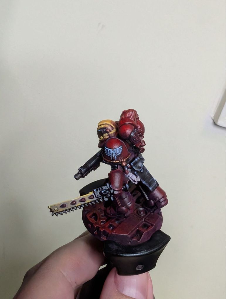
Onto highlighting the red. I tend to save this until last-ish so I can also repair any overspill onto the red areas from the other colours at the same time.
I use Army Painter Pure Red (the paint, not the spray) to volumetric highlight upwards facing surfaces like the tops of the shoulder pads and edge highlight everywhere.

Next layering up Wild Rider Red and then Fire Dragon Bright as final point highlights. Red is hard to highlight and it’s best to keep these highlight areas very small because otherwise it can start to read as orange rather than the deep red we want.

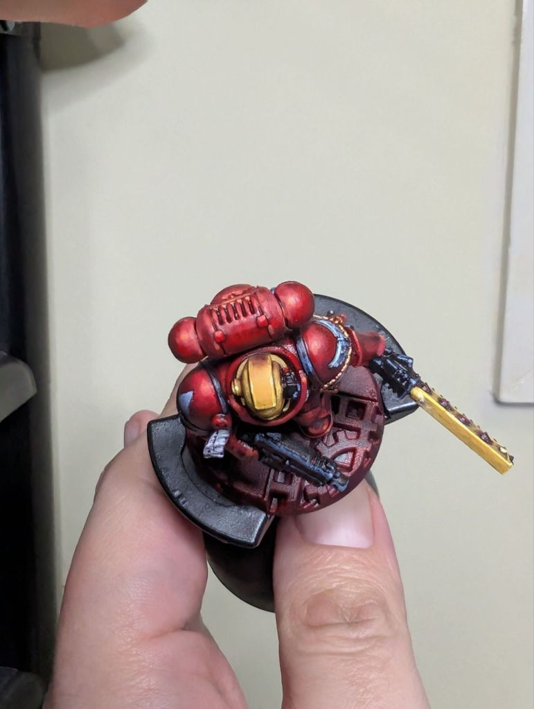
Another advantage of the purple shadow colour we’re using is that it helps to balance the orange and keep the overall perceived mid-tone as red.
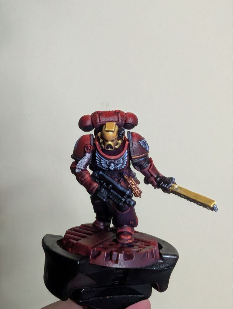
Final touches: silver (Vallejo Chainmail Silver) on the chainsword teeth and bolter barrel, etc. As mentioned earlier I then shade this, and any other areas I want to darken down a bit, with Drakenhof Nightshade.
Basing
Finally finally: the base. This army started out as a dedicated Boarding Actions force so I use spaceship/industrial bases for them. First I splosh on Akhelian Green contrast over the whole base, leaving some red showing through here and there for interest. Then splotches of Fuegan Orange for rusty bits.

I then do a light and patchy drybrush of Kabalite Green followed by Gauss Blaster Green to bring out the base details, add a bit of green to subtly complement the red without going full christmas tree, and nod to the Goblin Green glory days.

This marine is now done!
He isn’t going to win Golden Demon, but personally I’m happy with how he looks given the relatively small amount of time invested. I can easily bash out a squad to this standard in 2-3 evenings and not get bored doing it.



Leave a comment